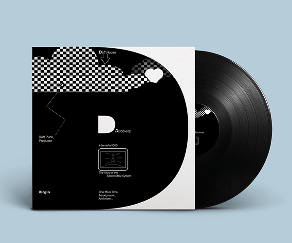
Hypothetical cover for Daft Punk's Discovery album that incorporates design inspiration from Dan Friedman and the Postmodern era.
Daft Punk were a French EDM duo that were active from 1993-2021. They were formed in 1993 by Thomas Bangalter and Guy-Manuel de Homem-Christo. This was after their previous indie rock band, Darlin’ disbanded. Their music has been described as “electrofuturism”.
They combine elements of genres from rock and synth-pop to funk and disco. They are also known for the fact that they assume robot personas. They are rarely seen in public without their robot personas. This was to keep their identity hidden from the public. Some of their most well-known songs include: Around the World, One More Time, Harder, Better, Faster, Stronger, and Get Lucky.
In 2021, Daft Punk announced that they were to split, but they didn’t give a reason as to why. Their music has inspired many and they are considered to be one of the most influential artists within dance music. Their music has been used in many media, such as Tron: Legacy and Interstella 5555.
The Postmodern movement is a movement that revolutionized the art scene. It was a movement that questioned and scrutinized the traditional and cultural norms of the 20th century. Its ought to impose a radical shift in how we view art and send a message to its target audience. A notable artist within the Postmodern movement was Dan Friedman.
Dan Friedman was a postmodern artist known for his radical challenges to the convention and commodification of art and design. He was a major contributor to both the postmodern and typowave movement.
Friedman was known for challenging the convention and commodification of design practices and sought to try something new. While Friedman did logos and branding for large corporation, he still wanted to subvert the principles with colors, font, and layout.
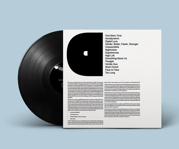
For this project, I wanted to combine the themes of both Dan Friedman and Daft Punk. I wanted to emulate Dan Friedman’s poster while adding elements of Daft Punk’s album to make it stand out. I wanted the album to be just like the music, focusing more on the content than the people behind it. It’s the reason why I did not include their front names in the front album, as I wanted to honor their pseudo-anonymous identity. In addition, the Big D is based on the first letter of both Daft Punk and the Discovery album (it could also be interpreted as being based on the first letter of Dan Friedman as well). There are other references to the album and covers, such as the heart in the Cloud and the TV playing Interstella 5555. This extends to the back cover, where I wanted to keep it as simple as possible while making the content appealing to the viewers’ eye.
Thanks to the feedback I received, I managed to incorporate the ideal album cover while retaining the simplicity and content.